Friday 13 March 2015
3. Evaluation Task 3- What have you learned from your audience feedback?


From the feedback I have received from my friends and classmates, I have discovered that they really liked the way that the products were linked by the colours and font used, particularly the continued look of black and gold colour which they felt suited the song well considering the song's title! A highlight for a lot of people seemed to the performance of the 'singer' Niya, as he really performed his lip syncing well and was a great presence in the video. While some of the lip syncing wasn't spot on in timing, they still felt that he was perfectly suited to the role and that he could pass for being the real artist. They also thought that the dancers were very skilled and that even though the majority of the video was dance, they didn't find it boring like they would have thought they would. One of the people I asked during the planning stages of this music video about what they did and didn't like in a music video said that they didn't like it when it was just dance all the way through, however at the end, she was one of the people who was very impressed by the dancing and felt that the story expressed in the dance was enough to give it more meaning. Overall, I think my video and ancillary tasks were well received and people enjoyed them.
Thursday 12 March 2015
Wednesday 11 March 2015
1. Evaluation Task 1- In what ways does your media product use, develop or challenge forms and conventions of real media products?
1. In what ways does your media product use, develop or challenge
forms and conventions of real media products?

1. Similar to many other music videos in this genre of dance-pop music, the video starts by introducing the artist and song name. From looking at a top 100 dance music videos of week website, it seems that most dance videos have a very varied and bright colour palette. I have chosen not to follow this theme and have stuck to a more muted colour palette of black and gold, in concordance with the title of the song.
2. This shot establishes the two main performers in an intimate way. A common theme in dance videos is that the dancing is often very sexual and bordering on vulgar. This dance however, contrasts with this as it is more styled around ballroom dance.
3. This shot and the entire section set in black and white take inspiration from Madonna's vogue dancing. The quick movements and emphasis on hands and arms as well as the black and white colour filter really link the two music videos.
4. The use of light behind Niya adds a mysterious and edgy effect that creates shadows and looks like a golden profile of his face. This mimics the sultry and shady look of singers in dark clubs etc.
5. As well as the previous style with the singer, there are also the shots where the singer's face is more visible, getting them the publicity and 'face-time' they need to sell their image.
6. Music videos often hold a new section/scene for later on in the video to keep the audience hooked. I have chosen to put in three sections of written lyrics to add something new about half way through the music video.
7. I chose this shot as an example of the way I put an emphasis on editing to the beat. In this shot, the movement of her eyes is in time with the beat.
8. Another feature that I saved for later was when two of the sections, the black and gold dancers and the black and white dancer, merged together into the same scene. As well as what I mentioned before about how music videos often do this, it is also a feature of this genre to mix scenes and change the set up during the video.
9. Few music videos in the genre of dance-pop contain a storyline but I felt that one was necessary to relay the relationships of the dancers and also create a visual that went with the lyrics, The story really comes into play at the end of the video, making the audience think back through the rest of the song for other moments that expressed the bitter-sweet nature of the song.
Monday 9 March 2015

6. Digipak Advert Task 6- Creating My Final Advert
Following the feedback I received for my mock advert, I then make the font size larger for the web address at the bottom, made the reviews in bold and changed two of the reviews to four stars. It was suggested to me that I blur the edges around the picture on the bottom right, however I chose not to as I felt it would look like it was just an image when it is actually the cover of my digipak.
Sunday 8 March 2015


Saturday 7 March 2015

Wednesday 4 March 2015

Tuesday 3 March 2015
Monday 2 March 2015

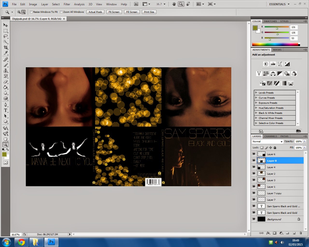
10. Ancillary Task 10- Creating My Digipak
Here are some screen shots of the process of creating my digipak. I created each face individually and then put them all together.

Subscribe to:
Posts (Atom)